
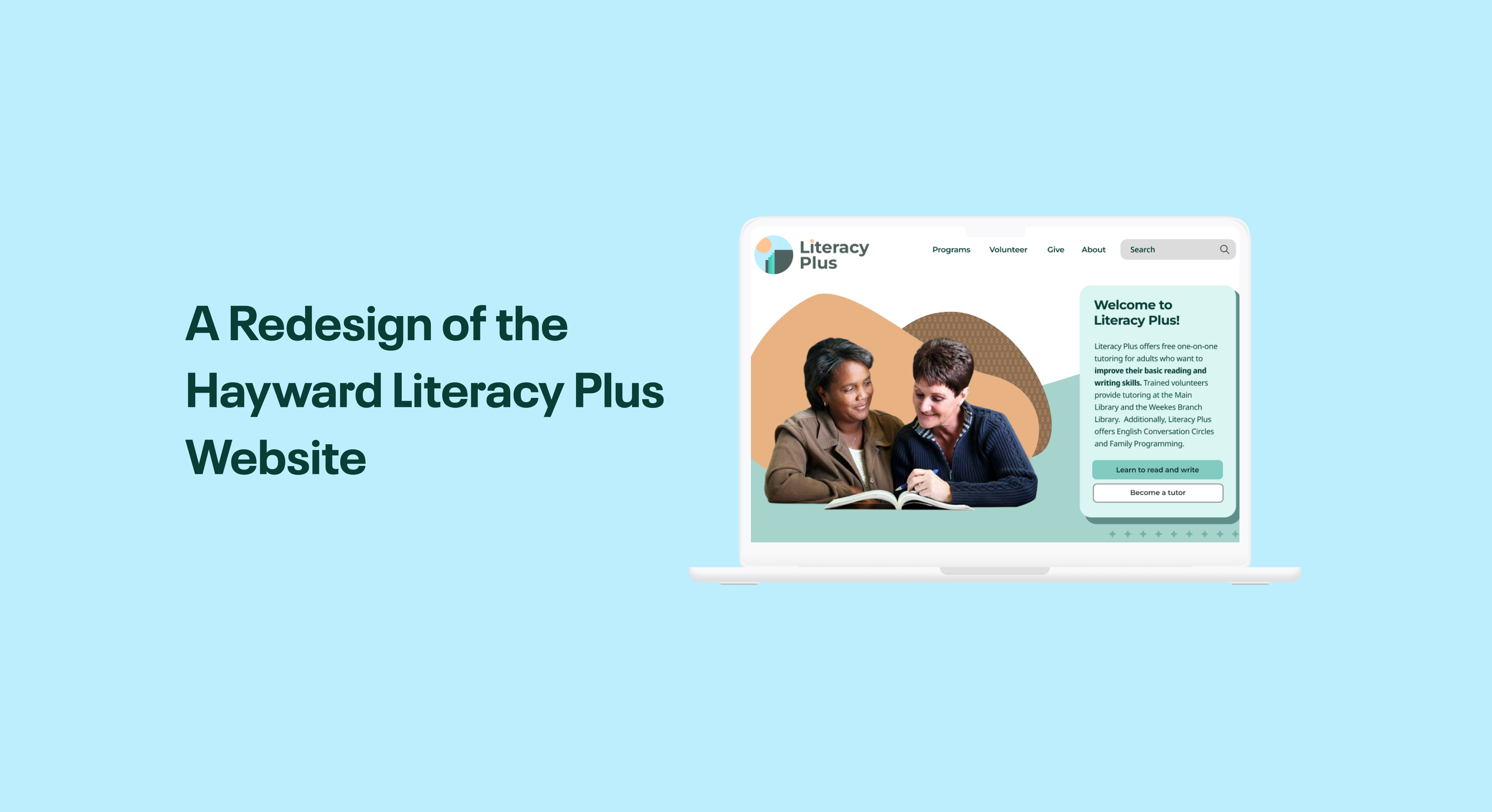
Education is Liberation.
The Hayward Literacy Plus Council also know as “Literacy Plus” aims to help break the cycle of intergenerational illiteracy in the Hayward community for adults and children.
The program promotes reading and writing competency, provides a computer learning lab, recruits and trains volunteer tutors, supports community outreach, and obtains general and financial resources as needed.
The purpose of the redesign of the Literacy Plus website is to modernize the overall look and branding in order to increase accessibility to its users.

My Role: UX Researcher, UX Designer
Collaborators: Elizabeth Beier, Tiffany Jones, Min Kerr-Schifrin
Tools: Figma, Figjam, Miro, Procreate
Timeline: 4 Weeks
My Contribution
On this particular project, I was the lead UX Researcher on this team. I was responsible for creating our research methodologies and conducting interviews with users, stakeholders, and other partners. I was responsible for gaining a deep understanding of the program, and the role it plays in the Hayward community.
Beyond initial research, I was responsible for heuristic evaluations and redlining of the original website. I conducted various user tests on both the desktop website and mobile website to gain insight into pain points and areas of growth. I then synthesized that research and created user personas, key insights, value propositions, new user flows, and the restructuring of the informational architecture.
Once low-fidelity wireframes and prototypes were created, I conducted user tests in order to gain feedback for the high-fidelity version of the website. I contributed to decisions on the high-fidelity prototype in terms of colors, typography, and logo redesign. Once the high-fidelity prototype was complete, my fellow designers and I presented the final case study to stakeholders.
My Design Process
With any project, my goal is to do an in-depth analysis of the users through primary and secondary research. By connecting with our users, we can determine key insights and design intentional solutions.

Reflections
This particular project was really rewarding to work on. With the power of community collaboration with Hayward Literacy Plus, the Hayward Library, and an amazing team of designers I was able to really see how powerful design makes an impact. Behind every decision made in the process was the intent of increasing accessibility and empowering others.
The limitations of this project came from structural disorganization common in public programs due to changes outside of our scope, the difficult nature of public programs transitioning digitally, and lack of resources. In order to get ahead of these limitations, as a team we relied on strong communication with stakeholders and partners and limiting the scope of our redesign to target tutors and learners rather than donors.
With more time working with Hayward Literacy Plus, possible next steps could include adding a translation feature to the website for the five most common languages spoken in the program, a redesign of the donor process, and additional testimonies from previous program members.
Research
Initial Stakeholder Contact
Michelle Gee - Program Manager at the Hayward Library
From Michelle, we learned that “Literacy Plus” is a program managed by the Hayward Library but funded and supported by the 501c3, “Hayward Literacy Plus Council”. This would be important information in the informational architecture of the final redesign.
Stephen Omondi - President of the Hayward Literacy Plus Council
We interviewed Stephen to get a full understanding of “Literacy Plus”. We were able to build from Stephen’s story the personality and breath of the final redesign, incorporating values of liberation, education, and empowerment.
One of the challenges we faced was how Hayward Literacy Plus is governed. Literacy Plus is a program hosted by the Hayward Public Library and managed by Michelle, however the website is owned by the Hayward Literacy Plus Council, the 501c3 that funds the program and acts as the decision making body of the program. We met with both individuals to gain insight on the program but ultimately communicated with Stephen Omondi, the President of the Hayward Literacy Plus Council on the redesign of the website.
Organizations like Hayward Literacy Plus
We looked into two non-profit organizations aimed at addressing the issue of literacy. From “Reading Partners” and “Room to Read” we learned about key features that would increase accessibility and modernize our site.
Important Features We Saw Were:
Strong Informational Organization and Hierarchy
Easy and Clear Navigation
Strong Branding
Good Hover Indications


User Research
Hayward Literacy Plus is a community-based organization centered around the users of the Hayward Public Library. For our User Research, we wanted to put a microscope on who are our actual users. From our initial contact with the organization, we learned that traffic on the website is mostly from people looking to be tutors, people who are already tutors, or potential learners in the program.
We found that it would not be worthwhile conducting widespread research with different types of users in the form of surveys, data analytics, or secondary research. We wanted to maintain our focus directly on our users.
Research Methodology
We decided to conduct 5 user interviews with:
2 tutors: Individuals proficient and passionate about the English language who work 1 on 1 with learners.
2 learners: English Language Learners looking to improve their literacy skills.
1 donor: Individuals who make donations that fund the program.
We asked 10 questions around 3 central themes:
Why did you choose to be involved with Literacy Plus?
Why are you passionate about Literacy?
What feedback do you have for the current website?
Key User Insights
User Insight for Tutors:
Tutors enjoy connecting with people over their love for education and relationship building.
Tutors are looking for a way to connect with the local community and give back.
User Insight for Learners:
Learners want to empower themselves to access the English language to better their lives and break generational curses.
Learners are determined individuals looking for accessible programs to improve their reading, writing, and conversational English skills with caring tutors who prioritize relationship building.
User Insight for Donors
Donors do not actually use the website often to make donations. They make their donations at events or in person via check.
Donors are often current tutors or previous tutors.
Define
Heuristic Evaluations
We chose to do heuristic evaluations of the most important pages to our stakeholders: The Homepage, Become a Volunteer, Learn to Read and Write, and Giving.
From our evaluations we were able to identify many areas of improvement.


Homepage
Become a Volunteer
Learn to Read and Write
Giving
User Testing & Observations
Consistency and Standards - The website does not maintain consistency across pages. Buttons have different colors and fonts are not congruent. Pages feel disconnected from a central theme.
Organization of Information - Information on the program itself is inconsistent and at times inaccurate. The overall organization of information across the website is disorganized, clunky, and hard to find.
Aesthetic and Minimalist Design - The content of the website is outdated. Content and visual design are not focused on the essentials.
As a team we conducted 2 interviews with various individuals to test the functionality of the original desktop website and mobile website in order to discover pain points, key features, and test the current user flows.
We asked users to complete the following tasks:
1. Find the Tutor Application
2. Find One-on-One Tutoring Service.
3. Find Donation Service.
Main Take Aways
Looking at the Original Website
User Personas
Based on our research we opted to only make 2 user personas, 1 for tutors and 1 for learners. We decided to not look at donors because they do not usually make donations through the website. We also learned that the donation page only allows anonymous donations through a private PayPal account, which our stakeholders expressed was in the process of transition.

Tutor User Persona

Learner User Persona
Problem Statement
The Hayward Literacy Plus Council website is challenging for both potential Learners and Volunteers (Tutors) because the website is outdated, inaccessible, and does not exemplify the impact of the program on the Hayward community.

Storyboard & Bringing Our Personas to Life

Simplifying & Reorganizing
We found that the main problems of the website came from the user flows and informational organization. We recreated the user flow and performed card sorting in order to create a new simplified site map.
User Flow for Tutors & Learners


New User Flow
Old Webpage Card Sorting
New Site Map
Design
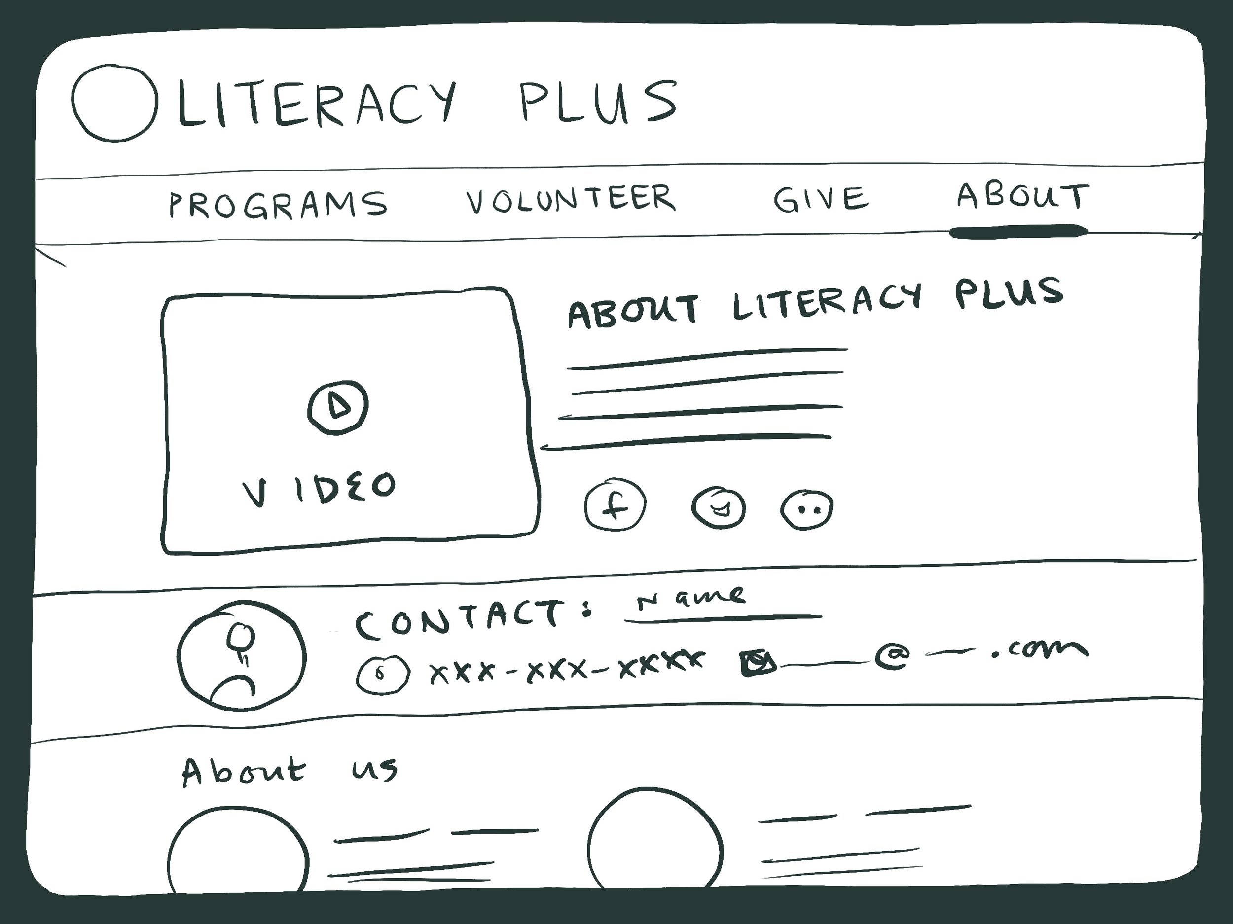
Sketches


Homepage
Programs
Volunteer
Give
About
Once we were able to create a new organized structure to the website we began drawing low fidelity sketches.
New Themes & Style
When redesigning the website we took careful consideration into the aesthetics and themes of the library. We wanted to use the reconstruction of the Hayward Library as the backbone for our style guide. We used features of the Hayward Library as our selections for hero colors, various hero patterns to represent the diversity of the Hayward community, and clear and easy to read fonts accessible to all learners.

Desktop Low Fidelity Frames
As a team, we conducted 4 low-fidelity user tests.
We used the same user test plan as from our initial test of the original website.
In order to gauge usability for our target audience we tested users:
whose first language was not English.
over the age of 45.
identified as NOT technologically savvy.
We asked users to complete the following tasks:
1. Find the Tutor Application
2. Find One-on-One Tutoring Service.
*We removed “giving” as a task because after speaking to our stakeholders, it is a part of their organization that they are revamping systematically.


Desktop Homepage
Desktop About
Desktop Giving
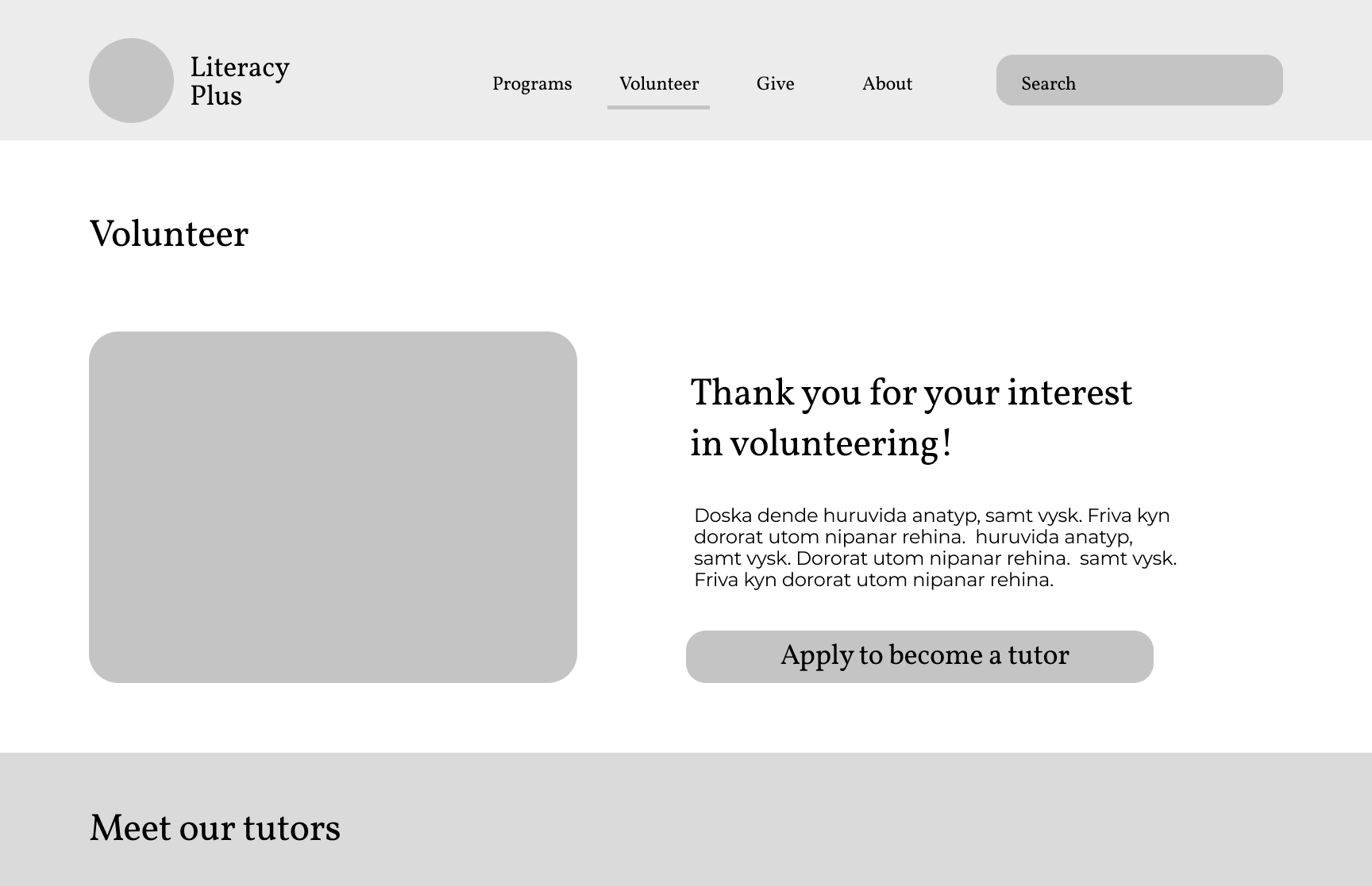
Desktop Volunteer
Desktop Programs
mobile Low Fidelity Prototype


Mobile Menu
Mobile Home
Mobile Give
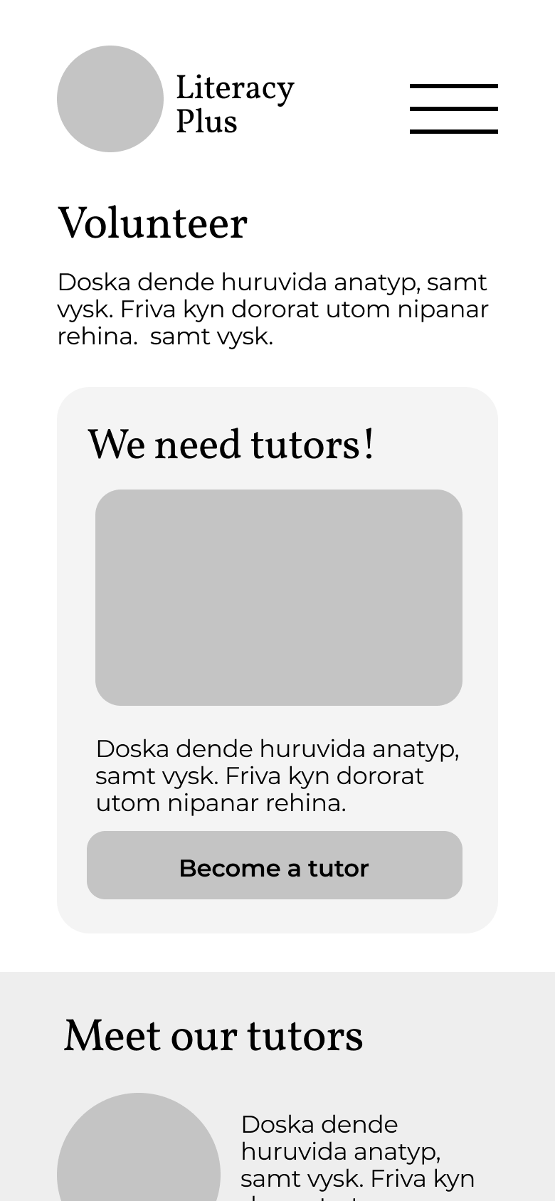
Mobile Volunteer
Mobile About
Mobile Programs
Low Fidelity Testing
Feedback
Consistent feedback from our user tests of the Low Fidelity Prototypes
Prototype should start on home page.
Changing the size of the hamburger menu.
Button size is inconsistent.
Check prototype flows because it leads to dead ends.
Changing student to learner.
Changing the search bar (it's too obtrusive).
Linking the logos so people can return to homepage.
Volunteer page doesn't link directly to tutor page.
Add links to program in the student and tutor portion.


Future Steps
Future Steps & Development
Present design at the next Literacy Plus Council meeting to get feedback from Stakeholders.
Add the “Translation” option so the website is accessible for those whose primary language is other than English.
Working with the Hayward Literacy Plus Council on creating a more user friendly and clear pathway for donors.
Creating a portion of the website that hosts where tutors and learners can have digital lessons or online classes.